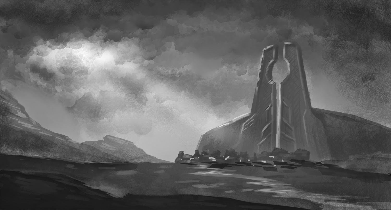
Here are the final three thumbnails I'll be producing for the first illustration.
I feel I've captured the essence of each location well enough that whichever one I choose to go forward with, it shouldn't require too much extra effort to take it through the colouring stage into completion.
Within each of these I've tried to focus on getting the scale of the location to read as being massive and imposing, while also controlling the lighting in such a way that it adds to the drama of each shot. I've presented a different style of scenery for each, by altering the appearance of rocks and terrain, but when it comes to finalising one of the compositions, a little extra variety might be required here or there.
At this stage, I'm thinking the bottom option is the one I'll go through with, mainly for it having that little bit of added interest in the jutting rocks.
After previously having had a brief study of lava-formed terrain, when it comes to rendering out each of the surfaces I'll make sure to include all the details of hardened lava throughout. I'll also be adding the towering volcano-home of Cobra to the far distant BG, further increasing the sense of depth and adding even more visual interest to the piece.
For colour palette choice, I intend to make it very dark across the rocks and mountains - grey-blues throughout - with accents of glowing orange-red mamga emanating from the cracks and holes in the ground. Dark smoke will also be added to the scene, to fit the author's description of the environment.
After a period of self analysis and relentless study, I've attacked this project with renewed vigour and have made major progress in the digital painting side of things.
For the first part of the project - to produce a piece of artwork that will portray an outdoor environment from the Death Dealer novel - I chose to focus on the area referred to as "The land of Smoking Skies". Cheesy.
So this place is described as being a land of active volcanoes from which black smoke arises, to hang in the air. James Silke scarcely describes the environment, but does make mention of black lava staircases leading into the largest of the volcanoes (the home of Cobra, the Queen of Serpents).
With this information, I set to sketching out some black and white thumbnails to get some kind of an idea for which direction I should steer this first illustration.
My initial intent is to make good use of the widescreen format of feature films to present a grand-scale establishing shot, which will include barren landscapes interspersed with mountainous terrain. Due to the nature of the black and white imagery, I discovered that it can be quite difficult to portray lava oozing from the mountains without them looking like snow-covered crags, therefore the magma side of things will be left until the colouring stage.
My first greyscales are thus:
In order to produce these 6 images, I'd pretty much been studying environment art from scratch. I was still getting used to digital painting, finding myself becoming confused by the variety of techniques to improve workflow and efficiency. At first, I thought these 6 were decent enough to be taken further, though something bothered me about them and I couldn't quite put my finger on what the problem was.
After taking a day's break from the thumbs, I returned with fresh eyes. This time, I figured that two things were wrong with most of them: a) my technique sucked, and b) none of them really captured the sense of scale and depth which I was aiming for. Back to the drawing board.
After a longer break from Uni work than I would've liked, I focused on getting my technique established before returning to thumbnailing. I'm not especially great at digital painting, so in between lots of study of environment artwork and trying to get a grasp of the fundamentals, I set about getting more experience with the Wacom, and really streamlined my workflow. Increasing the efficiency of my process allowed me to learn faster than before.
Here are a few of the sketches I produced during that time. These show studies of rock formation, lighting, and general painting styles that I hope to utilise for the foreseeable future.
With my improved technique, I was now happy that I'd levelled up enough to go another round with the greyscale thumbnails.
Over the past week or so, I've found a little bit of time between other projects to further enhance my environment speedpainting skills. Sticking to fundamentals, I generally focus on producing these paintings in black and white, limiting myself to 1 hour on each. I'm still finding that my skills are lacking, but I know the areas in which I need further study - mainly understanding the nuances of lighting, and rendering out materials enough that they read correctly.
Here are a few that I cooked up, with more images and details of my development process to follow soon.
Also, I'll be focusing on getting stuck into the initial thumbnailing process for the project very soon, so a few of those images will likely appear in a future post.