I've selected three illustrations which I intend to analyse in order to better understand some of the thought processes and techniques that, when understood and applied, should allow me to produce better environment designs of my own. Some of these I already know, but from this recent study I've been made aware of several techniques that can help to steer the viewer from one part of an image to another, while providing a narrative that supports and enhances the illustration as a whole.
For the most part - at this stage - I've chosen to focus on videogame-related artwork. This shouldn't be detrimental to my choice of film design as a project category though, as the artwork generated for both fields are so similar in style, execution and grandeur as to be one and the same (especially for the Fantasy genre). If anything, I would say that focusing my attention towards game artwork would actually yield greater rewards, with the game industry definitely taking charge of the genre at this point in time.
In a later post I will turn my attention to artwork created specifically for the movie industry, but in the meantime, here are my studies of a few of my favourite pieces of environment artwork of late.
First up is an image by Juhani Jokinen, a concept artist working for RedLynx. This piece is a photo-bash environment that utilises several important fundamental skills for arranging the composition and leading the viewer through the design.
Next is a piece of concept artwork for Dragon Age: Inquisition. Similar to the last piece, the artist who created this image has a superb grasp of the fundamentals, yet pushes the piece even further, creating a narrative that flows throughout the scene. The image as a whole is rich in details, with a sense of grandeur that compels the viewer to spend a long time studying it.
Finally for this post, I have a piece of Sci-Fi concept artwork by the artist Stefan Morell. Despite being of a different genre than my intended focus, I've included this piece as it uses techniques that will benefit me in my creation of Fantasy environments; using 3-point perspective, he creates huge architectural designs whose scale are further emphasised by the use of atmospheric perspective. This in itself is a valuable lesson to learn. By applying this to my own scenes, I should be able to produce larger-than-life, epic structures within my own illustrations.
Tuesday, 21 October 2014
Sunday, 12 October 2014
05 // Selecting a brief: Scene Design for Film - Death Dealer
It took a while, but I've finally decided upon the brief that I will tackle for this part of the course. After being stuck between choosing from so many exciting briefs, I eventually settled with "Concept Design 1; Scene Design for Film", my focus directed toward the Death Dealer series of books by James Silke.
The reason that this brief stood out to me is that as a kid, I was brought up on the Arnold Schwarzenegger Conan movies, so the fantasy genre has always been quite dear to my heart. In some ways, while the genre has blossomed in many different directions of late, I kinda miss the old ways - movies like Krull, Clash of the Titans, Sinbad, etc all had a real nice grasp of fantasy as being simply fantasy. Nowadays however, there's a need for fantasy storytelling to be grounded in some kind of reality - alternate or not. Things have to make sense and be explainable/believable for the audience to like it and/or agree with it. I get it, but I don't like that approach. I miss the old ways, where stuff just happened, regardless of it making much sense or being physically possible.
And so, upon hearing of the Death Dealer series, I knew this would be the right choice for me. Combined with environment design, I figure this brief will supply me with plenty of opportunity to enhance my skills in set design and digital painting, based around a subject that is sure to inspire me immensely.
My first task was to pick up a copy of the book. Through Amazon I managed to source out the first two novels; Prisoner of the Horned Helmet and Lords of Destruction. On my daily commute to Abertay, I'll read through both of these and pick out some key scenes that I think will be worth portraying.
As well as these books, my preliminary research will also include looking at shots from the Game of Thrones show and the more recent Conan movie.
Recommended by another tutor, I picked up a copy of Setting the Scene, a book that goes into great detail about the techniques and thought processes behind scene-building for animation, film and games. This could prove to be an invaluable resource when combined with all the other resources I have amassed of late. Oh, and not forgetting the art book for Naughty Dog's Uncharted 2 game, which has a heap of incredible concept and production images of environments that will provide serious inspiration for my own project.
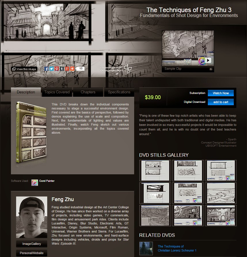
Finally - for this segment - I will shortly be placing my order for some of Gnomon Workshop's educational videos. Most notable are a series of videos by Feng Zhu, which focus on his techniques for producing environment drawings and paintings for film and game production. I selected his videos over all the others as lately my style of artwork has tended towards linework driven, high detail, dynamic compositions, which is also a favored approach by Feng. It is an industry-recognised style that I intend to pursue for the foreseeable future, therefore it made sense for me to apply it to this project too.
Saturday, 27 September 2014
04 // Live Drawing
This weeks task was something I definitely do not do enough of, but will be doing a lot more of in future. It may not be the easiest thing to head out and do; it can be a bit nerve-racking, leaving the comfort zone and drawing in public - especially whilst being scrutinized by passers-by - but it's pretty beneficial in that people when out in public tend to make some odd poses that you might never consider using when figure drawing. Therefore the study of hoomans in their natural habit can yield some pretty nice results. Plus it's good practice, which is never a bad thing.
So the first port of call was the exterior of the University building, where a throng of people gathered, milled about, wandered etc, making this a good spot to warm up with a few sketches/scribbles.
My choice of medium for this installment was a black ink brush pen. My reasoning for this choice was that I figured having the option to easily produce thin and broad strokes with a single implement would allow me to produce more variety in my mark-making, thus enhancing my ability to get more details down on paper in half the time. While the brush pen was definitely effective in achieving this, the nature of the pen makes it very difficult to control skinny lines, particularly when outside and trying to work effectively at speed.
Here are my first few efforts, including a couple from the interior of the library rotunda area.
All in all, not a bad first effort, give or take a few silly mistakes, and poor representations of the subject matter. Despite this, I definitely learned a thing or two from the exercise.
Following on from some post-sketching analysis, I decided that the brush pen was my main problem; its a tool I'm not entirely comfortable with at the moment, having not really put enough practice into yet. From what I've gathered, it excels in producing measured strokes, when time is plentiful enough to spare on ensuring that each mark is controlled enough to produce the desired results. In this case though, it resulted in too many accidents for me.
Considering which approach to take on my next endeavour, I returned to using my fave pens: a 01 fineliner for rough layout, form seperation and tonal work, followed by a slightly thicker fineliner for silhouette linework. Happy days!! The speed was increased exponentially just by using my two favourite pens! Without having fear of uncontrollable lines, I was able to get shapes down quicker and more confidently, producing far better results than before.
Fuelled by this new-found confidence - and having a comfy seat within Dundee train station - I was able to quickly get a few sketches out within 10 mins. There is definitely improvement within this second pass...
Saturday, 20 September 2014
03 // Tone and Shade
With this weeks assignment being to study an object and present an accurate depiction of its tone and shade, I set about with ballpoint pen and invested some time into discovering how successful I might be in applying the medium to this task. As is likely to be a running theme for some of this module, I fear that to a degree I was unsuccessful in my first attempt, though have leveled up a little in the time since.
Here's a snap-shot of the 2 objects I chose to draw in class; the vase presenting lighter tones, and the crumpled cone presenting a darker range.
My first sketches looked thus...
After spending a bit of time considering my self-critique and berating myself for making schoolboy errors, I came back for more punishment and produced this...
...but who was I kidding?? If anything, this was even further off the mark, soooooo after a swift crash-course in the technicalities of cross hatching, I got my ass in gear and knuckled down to produce a better result - albeit slightly watered down in terms of details.
Sunday, 14 September 2014
02 // Perspective Sketching Revengeance
After the last embarrassing post, I had to put pen to paper once more in a desperate bid to redeem myself. So here it is... still not perfect, but I'm getting warmed up now.
Unfortunately I went a wee bit over the time limit, but that was due to my need to make the lines look nicer than the shambles I posted before.
Honestly, that first picture should be tied to a post and shot.
Unfortunately I went a wee bit over the time limit, but that was due to my need to make the lines look nicer than the shambles I posted before.
Honestly, that first picture should be tied to a post and shot.
Friday, 12 September 2014
01 // Perspective Sketching
Here's my first perspective sketch for class assignment. I chose to present an interior, as I figured it would be a slightly easier method to ease myself back into this kind of thing. After completing the sketch, I feel as if I'm waaaaaaay out of practice!!
So I started by laying out all my guides as technically as I could with a cheap plastic ruler. Given the 90 min constraint of the task, time was definitely the main issue for me here, as I soon found myself running out of time to add objects and complete the finer details.
When it came to inking the linework, my freehand lines and pen control let me down horribly, resulting in an unfortunately messy finish.
So, to summarise, I'll be spending some serious time focusing on improving my draftsmanship in this area, which should hopefully increase my speed and efficiency. And then I'll make pretty pictures.
Subscribe to:
Posts (Atom)